


Let’s be honest: we’ve all made website mistakes. We’ve stared at our website and thought, “Why can’t I get this to look right?” You might be getting traffic but not inquiries. Or maybe you get embarrassed every time someone asks for your website link. If that sounds like you, you are definitely not alone and your website might be making some common mistakes that are easier to fix than you think.
As a web designer, I see the same website mistakes pop up all the time (especially on DIY websites). So let’s talk about 3 of the most common website mistakes I see—and what you can do to fix them today.
Here are a few Website Mistakes…
Mistake #1: Confusing Navigation
Imagine walking into a store with no signs and no clear direction on where to go. That’s exactly how your website visitors feel when your navigation isn’t intuitive.
The problem: Overwhelming menus, too many dropdowns, or clever-but-confusing page titles like “The Scoop” instead of “Services” can leave visitors lost and clicking the back button.
The fix: Simplify. Use clear, standard navigation terms like “Home,” “About,” “Services,” and “Contact.” Keep your main menu limited to 5-7 items max. Your navigation should feel effortless, not like a puzzle.
Mistake #2: No Clear Call-to-Actions
Your website isn’t just an online brochure, it’s your hardest working tool that should take your ideal client through a journey to purchase. If there isn’t a clear button telling your ideal client what to do next, they will leave faster than you can say “wait!”
The problem: You are amazing at your job and have offers on point, but if there’s no obvious button to click or step to take, your idea client won’t know what to do next.
The fix: Make your call-to-action (CTA) obvious, consistent, and compelling. Whether it’s “Book a Call,” “Grab the Freebie,” or “Get in Touch,” every page should gently guide users to that next step. And yes—it’s okay to repeat your CTA more than once!
Mistake #3: Your Website Doesn’t Feel Like You
This is a big one. Maybe your site looks okay but doesn’t feel like who you are. Maybe it’s too formal when your brand is warm and fun, or maybe it’s a sea of beige when your vibe is bold and vibrant.
The problem: When your website feels disconnected from your true personality, it creates friction. Your dream clients can’t get a real sense of who you are, and that won’t let them feel connected to you, so therefore won’t contact you. People want to buy from people they vibe with.
The fix: Infuse your website with your unique energy. Your copy should sound like you. Choose colors, photos, and layouts that reflect your vibe. Be professional, yes—but also be real. Your ideal clients aren’t looking for perfection; they’re looking for connection.
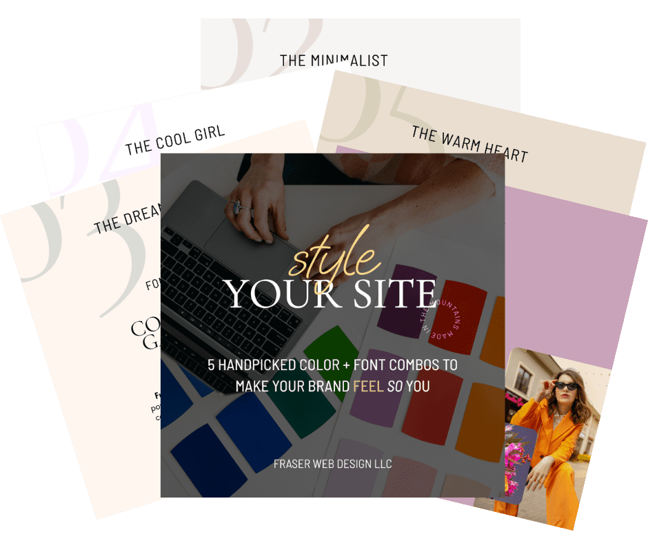
Not sure where to start? Grab my free plug and play Canva link with color palettes and font pairings to help your current site feel more like you.
Ready to make your website work harder (and smarter) for your business?
Your website should be unique to you AND bring in your dream clients on repeat. Curious if your website has all of the key tools to make it successful? Grab my free Website Audit Checklist here.
Because your website shouldn’t just take up internet space, It should work for you—bringing in leads, reflecting your brilliance, and showing up as your hardest-working team member.
Because your website shouldn’t just take up internet space, It should work for you—bringing in leads, reflecting your brilliance, and showing up as your hardest-working team member.
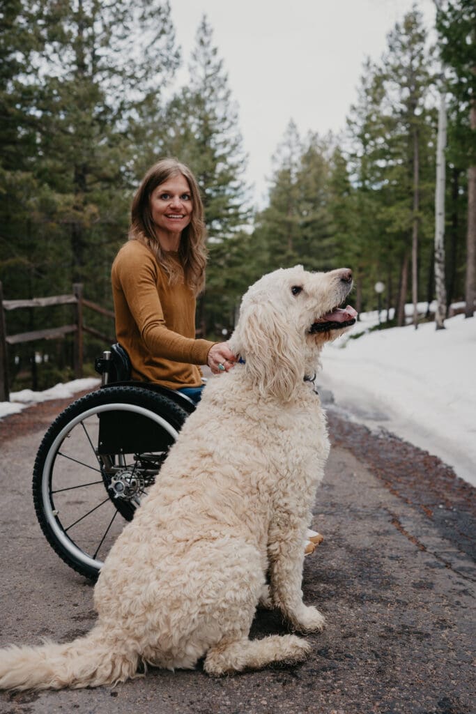
Hi! I’m Beth. Your custom WordPress and Showit web designer.
My life has been anything but ordinary. Web designer, Paralympian, and former flight attendant who once organized her stuffed animals by size just for fun.
13 years ago, I jumped off a cliff (literally), broke my back, and everything changed. Since then, I’ve worn a lot of hats—architectural drafter, globe-trotter, virtual assistant—but the one that stuck? Creative web wizard with a soft spot for bold brands and killer strategy.
Now, I geek out on all things web design, play outside as often as I can, and of course… make sure every pixel has a purpose. Whether you’re dreaming of a site that feels more you or one that finally converts browsers into buyers, I’m here to help you bring it to life—beautifully and strategically. Want to learn more? Check me and my work out here.

")


